
While you might be more used to banner ads on the Internet than in real-life (unless you have AdBlock installed, of course), printed banner ads are still big business.
In many cases, they offer a better way to grab people’s attention than with online banner ads.
Most of us completely ignore online banners – no matter how creative they happen to be – whereas with banner advertising in real-life, they’ll often be located in places where they simply cannot be ignored (e.g. along busy roads or as full-page spreads in magazines).
However, much like online banners, most real-world banner advertisements are extraordinarily uncreative and often, too complex and cluttered.
So, to restore your faith in printed banners (and print advertising in general), Fastprint.co.uk thought they’d showcase some of their favourite, creative, minimalistic banner designs below:
#1 – World For All: Train
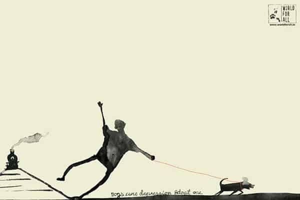
World For All is an animal care and pet adoption centre based in Mumbai, India.
They commissioned Ogilvy & Mather to create this stunningly beautiful – yet rather minimalistic – banner ad, with the aim of showing how adopting a dog can improve ones life.
The design itself is very simplistic and looks a lot like a watercolour painting; it portrays a dog saving a man from committing suicide along with the tagline “Dogs cure depression. Adopt one”.
#2 – VSM: Nature’s Firework

Being a Dutch homeopathic pharmacist, VSM might not be the sort of company that you’d typically expect such creativity from when it comes to banner ads, but they’ve certainly created something exceptional here.
VSM created this banner to “kick off” the New Year; the one pictured above is part of a series of banners under the theme “powered by nature”, all of which depict fireworks using herbal ingredients. In this case, it’s a flower that has been used.
Alongside the strapline “VSM wishes you a healthy 2013”, this ad promotes the homeopathic lifestyle in a non-invasive manner.
#3 – Musée De La Grande Guerre: Experience
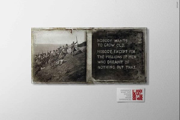
The Musée De La Grande Guerre describes itself as a “museum of history and society to help learn of past hardships and better understand the present day”.
To promote the museum, they commissioned a series of banner ads to be created (like the one pictured above), all of which feature the strapline “Experience what they should never have experienced”.
They’re simple and minimalistic, but also hard-hitting, thanks to the nature of the imagery portrayed.
#4 – Quebec City Magic Festival: Sliced Girl

Trade Sign Shops favourite, to promote the magic festival – which was to be held at the end of August – Quebec City hired the advertising agency, L2, to create this stunning banner ad.
If you’ve ever watched any kind of magic show, you’ll likely be familiar with the sliced girl trick, in which a girl (or guy) is placed inside a box and seemingly sliced in half, before being magically put back together.
The fact that these banners are all sliced in half not only manages to draw attention to the poster itself, but also the nature of the event that it’s advertising (i.e. the magic festival).
#5 – Axe: Revolving Doors
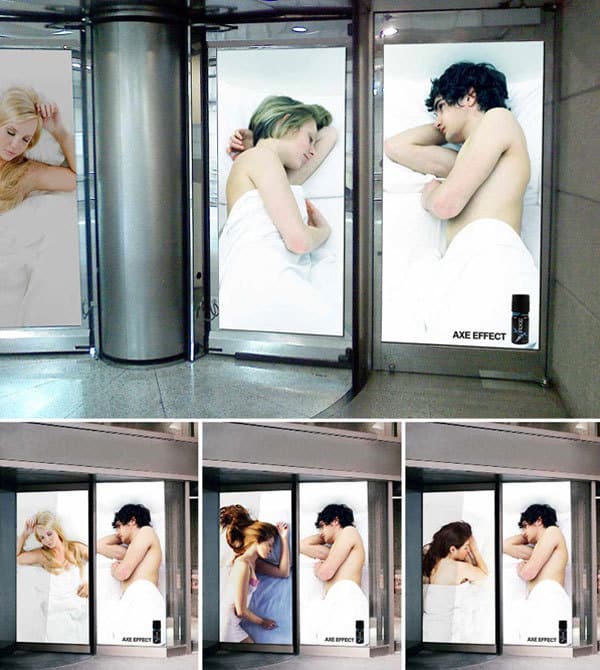
Axe is one of the most popular deodorant sprays in the world and for a while now, the bulk of their advertising has played on the idea that the deodorant brings on the “Axe effect”, which essentially makes the wearer irresistible to members of the opposite sex.
These popup banners play on that idea further and as you can see, depict a guy in bed with a girl. However, the image of the girl is actually placed on a revolving door, and as the door resolves, a different girl is depicted.
Clearly, this is all down the to fact that the male depicted on the banner must have been using the Axe deodorant.
#6 – Innocence in Danger: Girl

Innocence in Danger is a non-profit organisation dedicated to preventing the sexual abuse of children.
As you’d imagine with such a serious subject, their ads are generally created to cause maximum impact and create awareness for the brand. This banner, in particular, does just that.
The aim of the banner was to draw attention to the fact that sexual predators can hide in your child’s smartphone (this is the strapline on the banner, too); to achieve this, it depicts an outline of a hand in a child’s back pocket, with a smartphone being visible at the top.
#7 – Claro: God & Ape
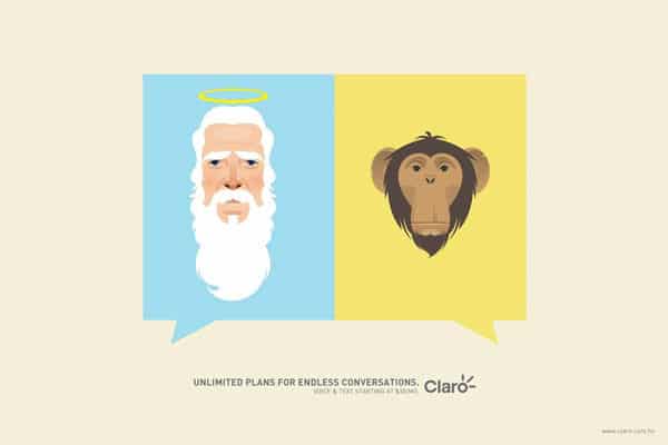
Claro is a telecommunications company, which serves customers in South America.
To promote their unlimited plans (which includes an unlimited number of minutes per month), Clara commission Ogilvy to create a series of minimalistic ads including the one pictured above.
By itself, the illustration might not make a lot of sense, but with the strapline “unlimited plans for endless conversions”, the message becomes clear. The illustration of God and a monkey illustrates a common endless debate between creationism and Darwinism.
#8 – Denver Water: Tandem
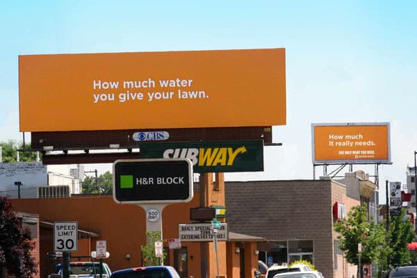
Denver Water is an organisation that regularly promotes important issues with creative banner ads, but in this case, there’s actually two.
With these banners, Denver Water wanted to highlight the idea that most of us use far too much water on our lawns. To illustrate this, they purchased two banner ads on a busy road, just a few hundred metres from one-another.
You can see that the first banner ad is large, while the second one is much smaller. The first banner reads “How much water you give your lawn” while the second banner reads “How much it really needs”.
It’s the size difference that illustrates the point.
#9 – Wonderbra: Fits Naturally

Wonderbra created this exceptionally creative banner ad to illustrate the unique selling point of their product: the natural fit that you receive.
Strangely, the banner doesn’t feature an image of the product at all; instead, it features two images of half-peeled oranges. It’s these oranges that represent the product and the natural fit that it gives.
Nothing fits an orange better than an orange skin; similarly, nothing fits on your body better than a Wonderbra.
#10 – Canon EOS: Beach

These days, most people take photos on their Smartphone’s rather than with a camera.
For Canon, one of the world’s largest manufacturers of professional digital cameras, this presents a problem: a lot of people aren’t buying their products, as instead, they simply use their phones.
So, they created this simple yet hard-hitting banner ad depicting a guy trying to take a photo, yet being interrupted by an old lady on a phone.
The strapline to the ad is “don’t let a call interrupt your photo”; the idea being that by using a Canon camera, you won’t get interrupted mid-photo as you might do when taking a photo on your Smartphone.
#11 – Hell Pizza: Rabbit
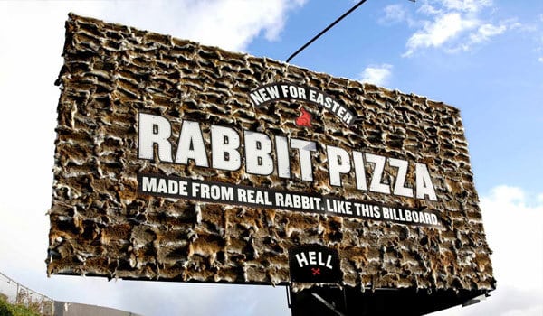
Hell Pizza is a New Zealand based pizza chain that certainly doesn’t conform to the norm.
In fact, this banner ad was created to promote their new rabbit pizza, which is created using real rabbit.
To illustrate this point, Hell Pizza made a bold move; they created the billboard itself from whole rabbits too.
I’m sure this ad captured the attention of a lot of people, although it may not have been for the right reasons (hint: animal cruelty).
#12 – IKEA: Happy Valentines Day

IKEA is a company well known for their minimalistic designs; in fact, minimalism is a prevalent theme throughout the company’s collection of furniture, so it makes perfect sense to extend this to their advertising campaigns too.
The company created this ad to coincide with Valentine’s Day. At first glance, it looks pretty simple and innocent. However, upon closer inspection, you realise that the two chairs in the ad are actually involved in quite a rude activity.
It’s a smart, minimalistic and humorous banner ad, although it may only invoke outrage amongst a select few.
#13 – Denver Water: Big Hair
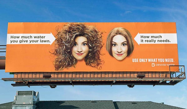
Here’s another creative banner ad from Denver Water, which like the two ads featured earlier in the post, also forms part of their “use only what you need” campaign.
This time, only one banner is used to illustrate the point, although the banner does feature two hairstyles.
The hairstyle on the left has clearly been sprayed with too much hair product, whereas the hairstyle on the right looks just perfect. The hairstyle on the left is meant to illustrate the amount of water people actually give their lawn, while the hairstyle on the right illustrates how much it actually needs.
Again, Denver Water has opted for a humorous approach to a serious issue, and it seems to be working.
#14 – Phillips Bodygroom: It Looks Bigger

Phillips created this banner to promote their Bodygroom for Men trimmer, and as you can see, the design is nothing but a collection of circles.
It might take a few seconds to figure it out, but when you do, you’ll see that although the skin-coloured circle on the left looks smaller than the circle on the right, they’re actually both the same size. It’s the varying sizes of the black circles around them that create an optical illusion.
But what has this got to do with trimming? Well, the black circles represent body hair while the skin-coloured circles represent, ahem, a private body part.
We’ll leave you to figure out the rest.
#15 – Staedtler: Architecture
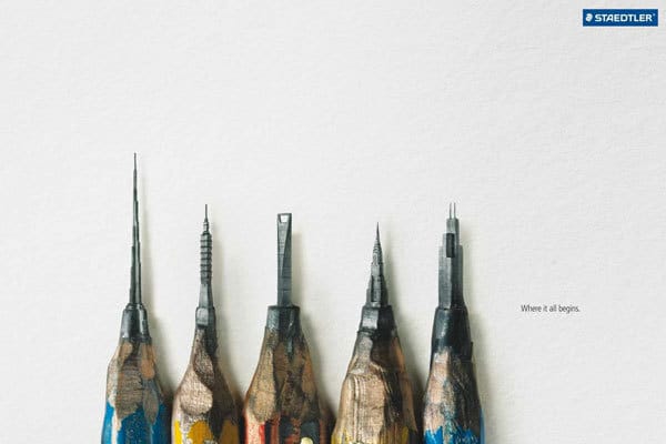
Staedtler is perhaps the most well known manufacturer of drawing, writing, painting, and modelling products (e.g. pencils, pens, etc.) on the planet, mainly due to the sheer quality of product that they create and the reputation they’ve built amongst illustrators and artists.
However, Staedtler didn’t create the banner above to appeal to illustrators and artists; they created it to appeal to a new demographic: architects.
The banner depicts highly recognizable buildings (e.g. Empire State Building, Burj Khalifa, etc.), all of which are crafted from the tips of pencils. Alongside the illustration, the ad features the strapline: “Where it all begins”.
The purpose of the ad is to illustrate that every great architectural masterpiece starts with a drawing.
Author Bio: Josh lives in the UK and absolutely adores print designer, especially the more minimalistic, creative-type stuff. In his opinion, less is more; he has a hatred for clutter.


Loading…