Finding the right font is almost an art form in itself. It’s far more of an art form than a science, though you can certainly do your best to break down the mathematics of how x height and spacing affect visual design. Whether for your blog, titles for a video, a banner design, or any number of SEO purposes, finding the perfect font can be extremely challenging and is often undervalued as playing a critical role in advertising and aesthetics.
Think of the font you use as the letterhead of your company, the watermark on your memos. The font is not just a technical asset, it is a strategic business decision.

Let’s take a look at some of the major factors in how font affects the message you are conveying as well as how it figures into the aesthetic of your design.
Personality
Font has a personality. While you always want a distinctive personality, you don’t want to turn people off with it by preceding yourself. That’s why in deviating from overused fonts such as Times, don’t go overboard and use a garish, offsetting typeface like Bauhaus 93 or Herculanum—unless of course those fonts happen to fit the particular aesthetic you’re shooting for (as in the cover of a German techno album or an epic Roman movie cover.
Headers and text samples can receive a more specialized look, but for the meaty body text you want to stick with simple and solid, like Helvetica, Univers, or a wide range of others.
Serif and Sans Serif
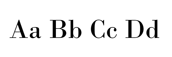
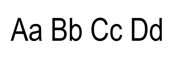
These are the two major categories of typography and each one has its own legion of rabid adherents. The word ‘serif’ essentially refers to the tiny nooks and hooks that round out some of the letters in a font.

When something is sans serif, it lacks these—for example thisis serif while this is sans serif.

Pro-serif font users claim that the serif font creates a sense of order and antiquity that makes something more readable; sans serif supporters say sans serif is the font of the future because of its broad contemporary appeal. You can find great fonts on both sides of the aisle, so in the end it comes down to personal taste.
Don’t clash
Rarely do you need to use two different fonts but when you do—for the sake of contrast or for another reason—make sure they either correspond or contrast. That means that you should not be creating conflict in the eyes and minds of the readers by tricking them with the font. Usually you can simulate these deviations by using weights and styles. In general, it is recommended to avoid using two different fonts on the same page.
Who are your readers?
When choosing a font you should certainly consider who will be reading your words. If your audience is largely finance-driven business professionals, you’re probably not going to want anything wild or unusual. Keep them in familiar territory. Conversely, if your readership is composed of science fiction or horror movie fans or some other niche territory, you will have a little more leeway and may be able to experiment with a creative font. This is true for content as well. If you’re writing about a legal issue you’re going to want your font to be as clear and crisp as possible. In general, few people tolerate a funky font for very long, so if your typography is difficult to read you better have a darn good reason, such as an unusual dialogue between characters in a fictional world.
Readability and portability
Think about the medium on which you’re writing: the Internet. This will present a different slate of factors than if you were choosing a font for a billboard or a movie trailer. Many bloggers swear by “Georgia” and “Arial” for their readability, as well as their portability across multiple operating systems and platforms. This is another sub-factor of readability. Just because a Mac user can read your blog on a Google Chrome browser doesn’t mean a PC user will have the same experience on Safari or Firefox browser. Especially if you’re planning on using a more experimental font you should conduct some research to make sure the font will look tolerable on a wide variety of platforms. There are even CMS plugins out there that can help you with this.
Choosing a font can be simple or complex, depending on how much thought you put into it. Indeed, there are university-level courses devoted to breaking down the geometric and philosophical impacts of varying typographies. But for all intents and purposes, you want to make sure your font will appeal to a critical mass of readers. You want facilitate the reading and sharing of your content. This is best accomplished by using clear, legible font that is readable on many different browsers and platforms.


Loading…