
There are no ironclad rules when it comes to designing the landing page of a website. However, you do have to steer clear of a few newbie mistakes. As the first point of contact between visitor and your brand, the landing page must deliver enough interest and engagement, else it will miss achieving its target resulting in a great deal of disservice to your prospects.
The landing page of your website must firmly grab a user’s attention if you are hoping to achieve a good conversion rate – and you have only a few seconds to do so. If your visitors can’t make out what you do within seconds, it’s just as good as showing them the way to your competitor’s site.
So, not only does your page have to load quickly, you need to send your brand message across crystal clear. Here are 6 other common mistakes that will keep you from reaching your goals.
1. Random Placements of CTA Buttons
Call-to-Action (CTA) buttons are the key to conversion. Therefore, it must be placed strategically. If they are obscured by flashy pop ups and placed in-between showy colors, you risk the chances user missing.
Design your site well, but do not reduce it to a boastful demonstration of your designer. Your site represents your business and it should look professional. The only way you are going to make it work for you is when the users click on CTA buttons.
You can make sure of this by studying your target audience and their behavior. Use heatmaps to determine eye movements and track clicks. Analyze and determine the placements for CTA buttons and you will start to see conversions.
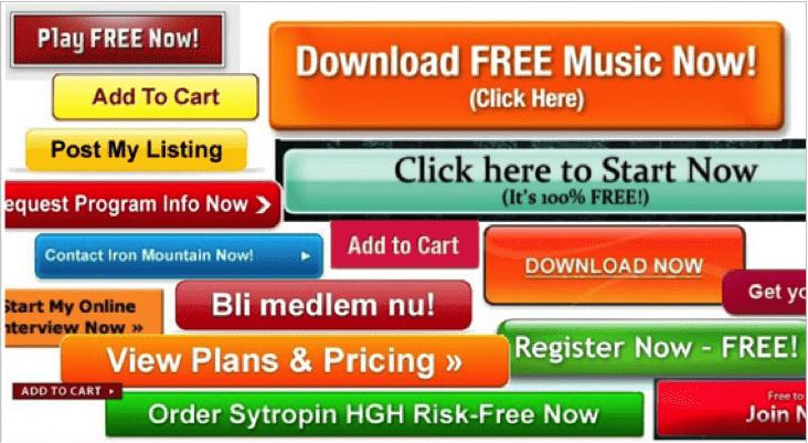
2. Using ‘Spammy’ or Uncreative CTAs
Let’s face it, the CTA button is more often than not viewed as the gateway to spam especially when it reads “Click here to win $500,000!”. Similarly, if you have a CTA that offers nothing in return to the user e.g. “Submit” or “Subscribe”, your results will not change. In order to ensure that your site’s CTA buttons are taken seriously, add text that is both beneficial and relevant to the user. For example:

In the simple example above, a simple but powerful Call-to-action briefly describes why users should press the button. This lets them know the benefits and incentive before your users click.
3. Badly Structured and Unclear Navigation
Now, there are two ways to go about this. The traditional (and more popular) way or the modern approach. Going traditional means having the menu always visible on the landing page so users don’t have to go looking for it. This way, they can be made to navigate across different pages of content in your website.

And then, there is the second approach to displaying your site’s menu. If your CTA buttons are correctly placed, and if they just about complete the purpose of having a website in the first place, it would be wise that the menu plays second or third fiddle to the buttons. So, you have to display it in a manner that there is no distraction from the CTA buttons.
There is a widely followed practice of having drop down menus as a part of navigational structure in websites. Is that a good practice? Definitely not. To begin with, your audience may not even bother to hover the mouse over those options. So they may not come to know that there is a sub menu on those buttons. Secondly, it is a bad practice from the SEO point of view as well.
4. Using Low-resolution Images

Images tell a story, and that’s what makes them an indispensable part of any brand’s advertising endeavor. On websites, it will help grab the users’ attention. So, most webmasters should add attractive images to their websites. However, you must be careful with the image resolutions and the image size. A pixelated image will only make the page look unprofessional and a large sized image will be heavy on your web page load.
Even if you have great content on your website, your competitors are likely to steal your thunder, only on the fact that the images on their websites are easy on eyes. Low resolution images leave a bad impact and make your landing page look juvenile and unappealing. When you have a high resolution picture that also happens to be relevant to your brand, you are already placing yourself on firm ground.
5. Having High-resolution Images That Are Too Large
While a high resolution, crystal clear picture is most likely to attract web users, how much does it burden your server? High resolution pictures come with their own baggage of problems.
A picture optimized in clarity and quality but untouched in size can prove to be a major disaster since it will affect the loading time of your website – and a slow website is the perfect ingredient to a recipe of disaster! Again, this allows your competitors who are clever enough to use the quality images with comparatively lesser size for their website’s pages.

There is a spectrum of some remarkably useful tools out there that will let you use high definition images on your websites, with minimum of sizes. Always consider the resulting load on the server. So, use the tools and extensions that compresses the size of the images without interfering with their visual appeal.
6. Crowding Your Site with Ads

Every publisher aims to earn big bucks with their websites and the shortest route to earning revenue is by displaying ads by networks like Google Adsense, Buy Sell Ads, Chitika and so on. While visitors typically understand the presence of ads and welcome them, flooding your web page too many of them will not only make your site look cluttered, but it will give the spammy vibe to the entire website. If you’re using ads, try to keep it as minimal and less obstrusive as possible.
In conclusion, these 6 landing page mistakes of your website can make or break your online business endeavor. Adopt the right approach, retain its singularity, and you’ll see results start pouring in.
This is a contributed post by Amy Brown, a WordPress developer by profession at WordPrax Ltd., a custom WordPress development company with a global reach. Blogging, is a new found hobby for Amy. You can get you in touch with her as the WP specialists of WordPrax.


Loading…