
It can be easy to get carried away by all of the different style choices available to you when building a website, or even when considering a new website builder or template.
But just because a design looks good, doesn’t mean that it is.
In fact, there are some poor design features that I see over and over on even the most impressive of websites.
These features can hurt your visitorship and even your conversions.
Fear not, however, as listed below are the most common design mistakes hurting your site as well as tips for fixing them!
1. Carousel Sliders
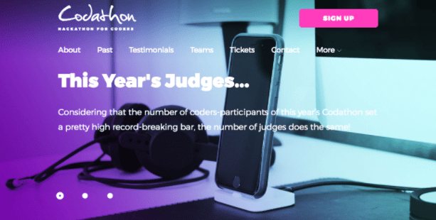
Carousel sliders are an essential part of nearly every website design imaginable. But there’s something you should know about them: they’re TERRIBLE.
I know it may come as a shock, but it’s true!
Image carousels go mostly ignored by users, yet take up a huge part of a website’s real estate. Thanks to online ads, people have been conditioned to ignore sliders in a phenomenon known as banner blindness.
Additionally, carousels slow down a website’s loading time and remove the focus from your content. This adversely affects SEO and prevents your reader from moving on to new content when they are on your website.
Much more effective is using a single image and, even if you have many images to display on your site, showcasing them using a different method, such as thumbnails.
2. Enormous Visuals

A large, full-screen background image can make a website look really high end and design conscious. Make it a video and, whew, how much did you have to pay the coder to do that??
Even though they look good and represent one of the most popular trends in website design, large visual backgrounds are harmful to your website’s bottom line.
This is because they serve merely as a way to slow your website loading times, and generally provide useless or negligible content.
This means that, while these big and beautiful HD photos create visual appeal, they aren’t doing much beyond that. Especially for users who are looking to get down to brass tacks and forgo your pretty design.
3. Camouflaged Calls to Action

If your website exists to try to get your visitors to do something (hint: this applies to most websites in existence), you probably have some kind of call to action (CTA).
All too often these CTA’s are either hidden or so similar to the rest of the website’s design that they simply become camouflaged and, as a result, ignored.
This generally occurs for two reasons.
The first is because the CTA uses the same design and color scheme as the rest of the buttons or images on your site.
The second is because your content doesn’t lead to your CTA. If you want people to notice your CTA, you have to make it noticeable.
A properly designed CTA can mean the difference between a bounce and a conversion and, often times, all it takes is a simple element redesign to see an increase in actions.
4. Poor Site Organization

The massive number of websites on the internet has set a standard for how things are organized and, yet, there are those who insist on making changes that are shown to negatively affect a user experience.
Most websites abide by a common layout: header, body, and footer. A header generally contains a menu from which users can navigate your site. There are some common sections you are bound to find, including Blog, Contact, and About. These are typical because people are used to them. If you change them, however, your site will take a hit.
Think about it: As much as titling your page ‘Get In Touch’ gives off a personable impression, it’s simply not as clear as a simple Contact page.
The same is true for eCommerce websites. Instead of organizing your products into strange categories, always go for what’s simplest, concise, and most commonplace.
5. Bad Content Layout

The last design feature on my list isn’t technically a design feature at all, but can affect your bottom line more poorly than anything else on this list.
One of the primary functions of most websites is conveying a message via text, but often times that message is lost within a jumble of poorly organized ideas and large blocks of text.
If you were paying attention through this article, you’d have probably noticed that I don’t write using long, drawn-out paragraphs.
I keep things fresh and concise by transitioning readers on a nearly line-by-line basis.
If you are relying on long blocks of text, consider how simply adding a few spaces can change your sites readability and overall design.
No matter how pretty a site looks, it is worthless without a high conversion rate.
Once you fix these common design mistakes, I guarantee you will see results.
Loading…