
Knowing the right lingo is an important part of a profession in any field. This is particularly true in a field as artistic and terminology heavy as graphic design.
- Font vs Typeface

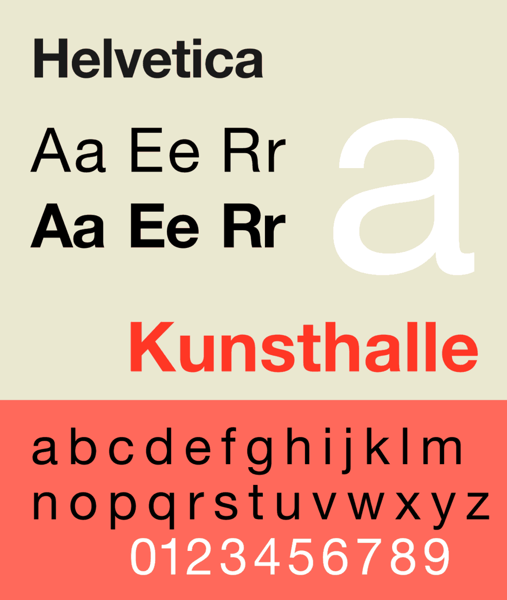
A typeface is an umbrella term that refers to a style of letters, numbers, and symbols.
For example, Helvetica is a typeface. Variations on that typeface, such as bold and italic, are referred to as fonts.
An article published on Nerd Plus Art sums it up perfectly: “a typeface is like a song, and a font is like a recording.”
Meaning, a typeface refers to a conceptual design, where as a font is an interpretation or variation of that design.
It may seem like splitting hairs, but you can spot an amateur or professional graphic designer by who knows the difference.
- Tracking vs Kerning vs Leading
Within a body of text, there are different techniques graphic designers use to manipulate the way letters or characters are formatted.
Tracking refers to the uniform space between each letter or character.
Kerning refers to, more specifically, the space between two letters or characters.
Leading, on the other hand, is the vertical space between lines of text.
- White Space vs Negative Space
To an amateur, these two terms may seem interchangeable. But actually, they are very different.
White space is simply the unmarked area on a document not covered by text, graphics, or images. It doesn’t have to be white. A black, green, or purple background would still be referred to as “white space” by a professional graphic designer.
For example, the unoccupied areas of the Datacenter site would be called white space. ![]()
Negative space is a tool used to create a visual illusion. It is the area around or between an object or image.
In the iconic NBC logo, the peacock feathers are the actual illustrated image, while the peacock takes shape in the negative space of the design.
Essentially, white space is the area on the page left uncolored, while negative space is like an “erasing” of the image on a page to create another image.
- JPEG vs PNG vs EPS
Graphic design isn’t just about design. You also have to be well versed in file types to come across like a professional.
A JPEG is a filetype that is ideal for basic printing and web uploads of an image. It compresses the image, so enlarging it will cause your image to look pixilated.
A PNG file will have higher quality than a JPEG, and it maintains a transparent background. This is a handy way to save portions of a design that you plan to incorporate into a larger project because only the image is saved, not the negative space.
EPS are vector files. Vector files are scalable, meaning they can be enlarged to any size without losing quality.
Now You Know!
Want more? Check out our helpful tutorials on everything from Photoshop to WordPress.


Loading…