
 CrazyLeaf Editorial
Whether you are making a fresh website or giving the current one a new look, there is no escape from Search Engine Optimisation or the arguably infamous SEO.
Alongside other effective digital marketing strategies, SEO has been popular because of its benefits. For instance, implementing a solid SEO strategy can help your online business get high-quality traffic because it attracts more users to your website. Since SEO techniques are designed to attract leads, they may provide an impressive return on investment by increasing conversion rates.
Also, another key benefit of SEO is that it can enhance the credibility of your website. When your site ranks highly on search engine results page, it means that Google and other major search engines recognize your website as credible or trustworthy.
With all these things being said, SEO is something your business should never take for granted. But how do you know if your SEO campaign delivers excellent results? This is where SEO checking and testing comes into the picture. When you get your strategies checked and tested, you’ll know if you’re doing SEO the right way for your business.
In fact, checking, re-checking, testing, re-testing the validity of your SEO techniques should be an integral part of all your website design strategies.
Generally, SEO testing can provide you with an opportunity to improve your strategies and gain a more desirable outcome. Thankfully, there are many SEO testing techniques you can use to determine areas that need improvement. Mainly, you can perform A/B testing to see which keywords bring the most traffic to your site.
Did you know though that you search engine optimization strategies could be influenced by the design of your website? It does sound counter-intuitive, but when you pay close attention to the details, you will realise that your design indeed goes a long way to get you those elusive PRs and rankings on the SERPs.
Let’s start at the very Beginning: Bootcamps

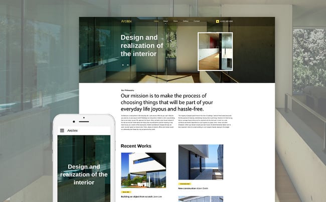
It is indeed a very good place to start. Educate yourself. And it is hardly difficult these days. You have tons of learning tools out there that can teach you the basics and as you progress, you can move on to the advanced stuff. In fact, this bootcamp bundle covers a whole lot of ground. You can very quickly pickup how to set-up your first few basic WordPress sites. Then you can move on to setting up eCommerce website and learn how to make them responsive. Once you are there, you can move on to master the all important WordPress and come full circle with an SEO course!
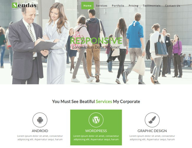
Keep it Simple and Sweet: Easily Usable Website

Of course, you want your site to be simple to make and maintain. Search Engines give extra points for usability. But, what you want even more is that the user should have no difficulty in using your site what so ever. This means you have to give your users what they are used to; but at the same time you know you have to surprise them with some novelty, something unexpected. Take a look at this bundle that is currently available for a free download – from standard login forms to ribbons and badges to navigation tools to rating and notification tabs – it has some standard things that every website or mobile app needs. Once you are ready with the norm you can add in plugins for the fancier stuff like sliders, etc.
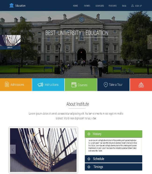
Adapt to Dynamic Technology: Responsive Design
It is only a slight exaggeration if we said, there are as many variations of devices that websites are browsed on as many people who use those devices. In fact, one person must use 2-3 devices on an average, if you count their mobile, tablet, PC, office computer, and a wearable or two. Now, multiply that with the number of screen sizes and other distinguishing features and you have an innumerable range of devices that your website has to appear exactly the way it is intended. This responsive design – design that adjusts itself automatically as per the operating system, size, etc of the device – is recommended by Google. That is Google clearly stated, not too long ago, that it will give better rankings to sites that are easy to read on mobile phones.
Go Designer: Responsive Design Elements

Don’t restrict yourself to just one responsive template. Once you have your basic design tried-tested, up and running, you can tinker around with individual design elements. Each element of your website can be replaced with something else that catches your fancy, which is also responsive. For example, you can change your menus or what is also called navigation bar that is compatible with multiple operating systems or browsers or devices.
Beware of New Technology: HTML 5
So sure, you have to adapt to new technology, else you will be left behind. At the same time you don’t want to go in blind that might lead to unintended disasters. For example, a HTML 5 page that is not coded properly can appear as a blank page to Google. All the time you spend on a cool animation might be down-ranked by Google because well, the big G can’t see it. You should know to represent your HTML 5 content with static content so that your site is indexed the way you would like it. There are templates and bundles thereof available that take care of that for you.
Keep Touching Up: Seasonal changes
One other important aspect of ranking higher and higher on search engines is how often it is updated. With newspaper like formats or blogs it is relatively easier to have frequent updates for the websites. However, if you have a more or less, information-driven static website at hand you will have to walk that extra mile to make yourself look newer to the likes of Google and Bing. What you can do then, is adapt your themes to seasonal changes. Change the look, feel, text, context with actual “Winter is coming” weather changes to templates designed for festivals.
Look Outside the Site: Social Media

The number of comments on your site has been known to be one of the many parameters for search engines to decide what your page rank ought to be. The day is not too far away when things like number of followers / likes / fans of your social media pages and interactions there like Shares / ReTweets / Favorites will also count. What you want then is for visitors to easily find your pages on the relevant social media platforms. Of course, the job won’t be done and you will still have to create engaging content, but having the share buttons on your website is not optional.
The point is that even though Search Engine Optimization could seem limiting by imposing a lot of restrictions, there are ways to get creative and keep the viewer hooked. Also, there are many, many tools available to help you through the technicalities and the number is only growing. We have linked to 10 free ones that can help you achieve the aim of your website design strategy while keeping the requirements of search engines in mind. Is there any other point that you keep in mind for SEO? Is there a specific tool you use that helps you achieve your SEO goals?
Author Bio:
 Swati is a nature-freak, loves traveling and capturing unforgettable memories along the way. She loves singing and driving – often, both at the same time. Her favorite passtime is to hangout with her family and friends. She believes in work hard and party harder. Swati is responsible for updating DealFuel blogs – a daily deals site for web designers and developers with some really good deals and freebies.


Loading…