
Flat as a pancake is apparently all the rage these days. The removal of any trace of drop-shadows, bevels, embossing or edgy gradients has the digital landscape looking like as smooth as an ice rink as opposed to the bumpy surface ruled by chunky buttons and skeuomorphic designs.
Focus has shifted towards the usability and minimalist functionality of simple User interface and away from the chunky 3D designs popularised by the early iPhone UI’s. Because of it’s simple, bold colours; open spaces and lack of eye-popping details, flat design has become a leading proponent of this new focus.
Perhaps the overwhelming signifier of Flat Design’s (see a good article about it here) current popularity has been it’s adoption by Apple for the iOS7 (see an article about it here). To be welcomed by industry leaders as influential as Apple would suggest that Flat Design is going to be around for the duration, but the question we want to ask is not based on the trends popularity, but on its suitability. Just like you wouldn’t run out and buy the latest Gucci bikini if you were living in the Antarctic, why would you use Flat Design if it is completely unsuitable to your business?

Recognising a Flat Design website
Minimalist style
Flat Design is simple by nature. The idea is to scale back your site and leave just the essentials and important features- this will allow them to stand out of the page on their own.
Fonts
Since the design is so simple and constructed from basic shapes, the typography will often become the focal point of a Flat Design website.
The font style transmits a brand’s identity and style. Flat Design’s nature serves to make typography far more visual and increases its importance in the overall identity of the website.
The font should look good on a minimalistic environment, for example sans serif, and suit the website in character and tone.
Button style
The buttons are characterised by simple shapes without gradients lights or shadows, instead, they have a strong plain colour that highlights from the rest of the site. Strong contrasting colours are the preferred method of distinguishing different features on the website.
Colours
Flat design colours can be bolder and vibrant than most other sites due to the lack of detail interrupting the color. Colours will often be coordinated to allow for easier navigation of the site. Think pure, clean and light.
Shapes
Geometric shapes dominate the flat design landscape due to their elegant simplicity and clean cut edges.
Icons
Information that doesn’t have to be written in text won’t be. Clutter is a killer with flat design, so anything that can be displayed as an icon will be an icon. Iconography becomes important as a method of keeping your site clean. For an in-depth analysis into the what makes flat design, visit this brilliant article by Christopher Jackson.
Should I go ‘flat out’?
The biggest misconception amongst those looking at adopting a flatter approach to design is the belief that flat really means FLAT. Flat images, buttons, font, flat everything. The idea of being wholly flat or skeuomorphic isn’t really applicable, as websites will rarely operate with a complete absence of either.
Flat Design is an approach that some can take too literally. Most sites can benefit from taking the best aspects of flat design and applying them in a manner that is suitable to their website. Sites using aspects of flatter design may have a geometrically designed site with minimal embossing and shadowing, but then have a large portfolio of images or a logo that doesn’t completely adhere to the same flat rules, so too attempt to rigidly adhere to a flat principle will certainly limit your capabilities.
If you are selling a product, then your site will likely feature many product images. These images obviously aren’t flat and will add a depth to your site in a manner normally avoided by flat design.
Its important to not let yourself get preoccupied with making everything as flat as it can be. Somethings will help your site, somethings won’t. Your websites style and theme must also be reflected by your web design. If you are a creative digital agency in Manchester who pride themselves on being on-trend, then sure build yourself a fancy flat design website. Take a look at this site by Nitrografix.

The aesthetic suits the agency to a tee. It provides uncluttered, easily navigable information for those looking to use their services and can be used to maximise their creative nature (as well as letting everyone know how trendy they are).
However, a flatter design aesthetic sometimes just doesn’t suit the content it’s trying to share. Check out the website for World of Warcraft.
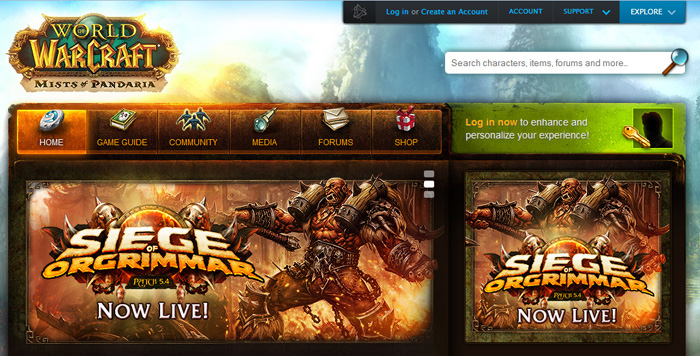
A flat aesthetic would look out of place here. The chunky nature of the navigational tools and the images is suited to the arcane and medieval features of the game. To depart from this towards a new flatter aesthetic would disconnect the site from the product it is promoting and simply isn’t relevant.
Before considering an alteration or redesign of your site, it is important to first consider the relevance of a flatter aesthetic. Will it suit your content? Does it suit your product? Can you implement it without distancing yourself from your consumer and your company image? More importantly perhaps is can you apply flat design to your site in a way that is beneficial? Just like any medium of design, a flatter aesthetic can be misused and damage your site as opposed to refresh it. It is important to remember that good design should always transcend trend, so every change you make should be carefully considered before you go jumping on the bandwagon.
How do I know if my site suitable for the rolling pin approach?
We’ve put together a loose guide to help you judge whether or not Flat Design is the right option for your business’ website. This isn’t intended to be an exacting guide as everyone will have different needs, but some of these points should be seriously considered before making your decision.
Go for it if :
- Your audience will be able to navigate around a Flat Design site.
- Your websites message can still be effectively broadcast through the a flatter style.
- You have lots of informational content that would benefit from a crisp, tidy design.
- Your website is full of over-indulgent designs that get in the way of the main functionality of your site.
- Progressive design is suited to your industry; digital and tech agencies are a yay, childrens sites are a nay.
Stay chunky if :
- You fear your audience will fail to adapt to the Flat Design.
- Your content would not benefit from a cutting edge design. If you’re a dry cleaners, why change your website to Flat Design? What would it offer?
- If your content relies on visceral content to create an emotive response from your audience.
- If your website relies on visual, interactive engagement, flat design can prove limiting. Imagine you’re running an interactive game website for kids. Booooreeeddd.
Don’t let your web design leave you feeling flat
Your website is essentially the vehicle for your companies online presence. Avoid suffering from a ‘flat’ tyre when it comes to redesigning your website.
- Despite the name, being flat isn’t the be all and end all. Flat Design is about minimising over ornamentation and reducing everything to a simplified level. Make it simple, but don’t make it look stupid.
- Don’t just copy the big players. Sure Microsoft love to use tiles and boxes, but this doesn’t mean you do too. Avoid becoming just another lookalike and use shape and curve to mix it up.
- Don’t neglect typography. So your website is simplified and boldly coloured. Great. Your websites message will virtually rely on effective use of typography and the simple nature of flat design will only serve to emphasise this. Give your typography the thought it deserves.
- The aim of Flat Design is to allow the elements of the page to stand out on their own. Make sure you organise them and portray them to allow this effectively.
Conclusion: Is the world back to thinking flat?

Proponents of a ‘flatter’ approach often wax lyrical about the improving ‘technical literacy’ of the global population. With digital competency at an all time, high followers of a flatter style will denounce the need for whimsical buttons and features that still aim to directly reflect a real world counterpart. In some ways they are right. Give anyone an iPhone or direct them to a website and they will likely be navigating their way around in seconds. Yet, the question of usability still arises. Humanity’s click and close approach to the web still requires that websites are overtly obvious in what they offer and how you navigate around the site. Does flat design limit these capabilities? Almost certainly if misused.
Flat design does however adhere itself to another growing trend in the digital world. Responsive web design is quickly gaining steam, and is perhaps now much preferred over having a standalone mobile site counterpart. Flat design naturally lends itself to responsive web development, with its light page weight, geometric planning and simpler designs easing the progression for a responsive site.
At the end of the day, this sudden preference for flatter features has been prompted by the adoption of flatter aesthetics by a number of global leaders and, understandably, a lot of the world has followed. What must be remembered is that trend is cyclical, and like all design trends, flat design will eventually decline in popularity. There are aspects of flat design that really lend themselves to improved functionality but it is still not a universally suitable style for all. Carefully consider your real needs for your website. If a flatter look will lead towards better functionality for your website then the decision is commendable, if you are forcing it upon an audience that is unreceptive or onto a site that it doesn’t suit, flat design is just a fleeting fad that will soon pass you by.


Loading…