Short homepages are starting to appear more often gone are the days of scrolling.
Almost all the information is above the fold.
This requires marketers to prioritize what matters as there is not enough room to put 6 different marketing messages on the homepage.
That means — no fluff.
This trend has been sweeping across big and small companies.
The main reason is it makes the user focus on one message and ultimately an action (often to sign up).
Now many SEO experts would cry out that this is terrible for SEO but a recent Yoast article outlines that homepage SEO may not be a thing beyond branded keywords.
Think about it, how much of your organic search comes to your homepage from keywords that are not branded? For most companies, their organic search is coming through blog posts or more specific pages.
Now this is obviously not entirely true for every company as a search for something like “social media schedule” returns the homepages of Buffer and Hootsuite.
There are also examples of short pages outperforming long pages when it comes to conversions.
Below we outline some of our favorite short homepage designs.
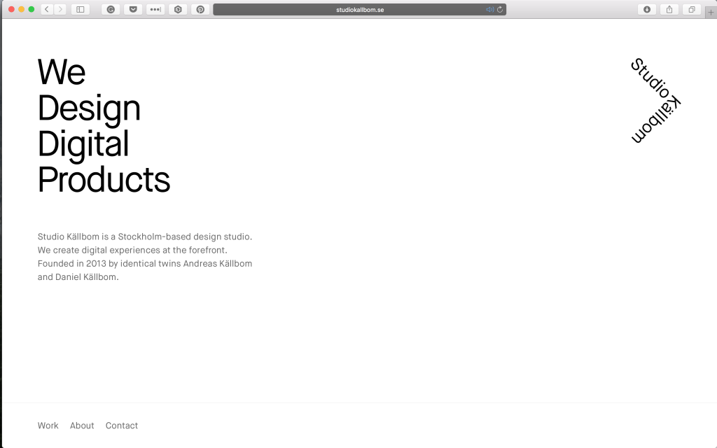
Studio Kallbom
This agency has a homepage that is short and to the point.
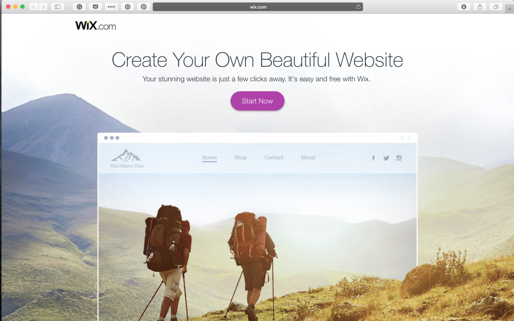
Wix
Wix is one of the worlds most popular website builder. It might be surprising that their homepage is actually quite short. Pushing users to build their own website.
Quora
We noticed many social media sites homepage is quite short. This is probably because they act as a landing page to sign up for the platform.

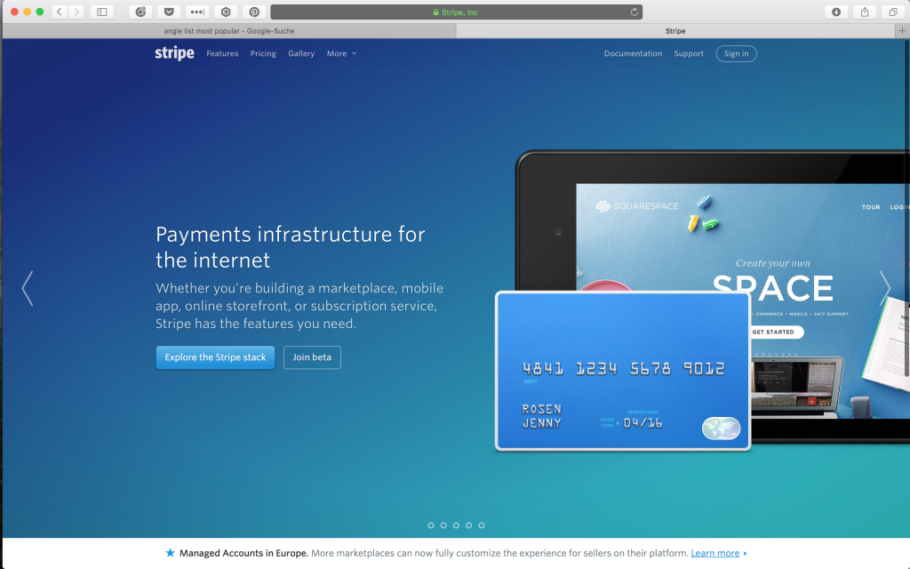
Stripe
Stripe is one of the best ways to accept payments on the web. Their homepage is direct and to the point. No need to spend time scrolling.
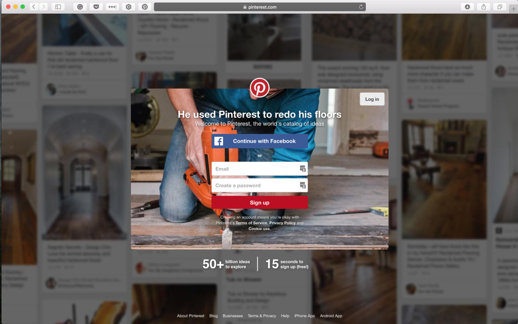
Pinterest homepage is just an overlay of a sign up form over the application. You can’t scroll if you want to!
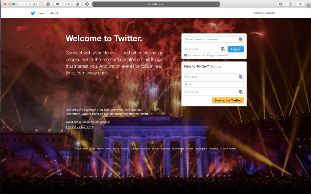
Twitter also has a short home page landing page. The background image changes each time.
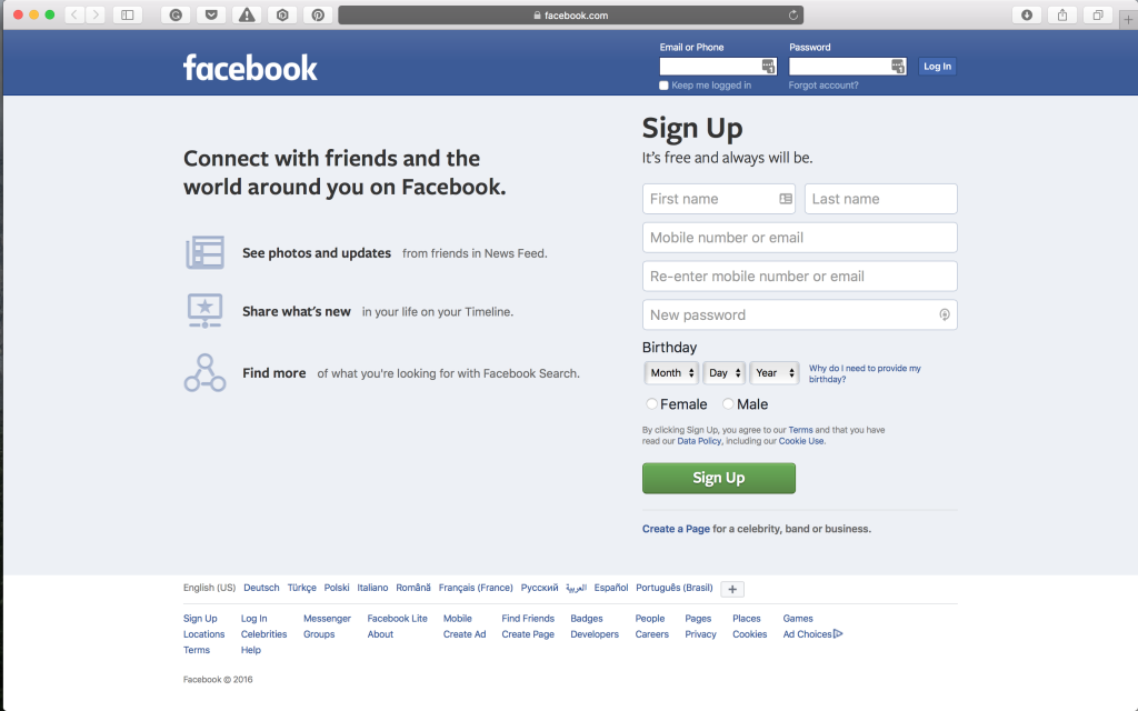
Facebook has a very clear home page with three benefits. It’s surprising to note there are no photos for such an image driven product.
Mailchimp
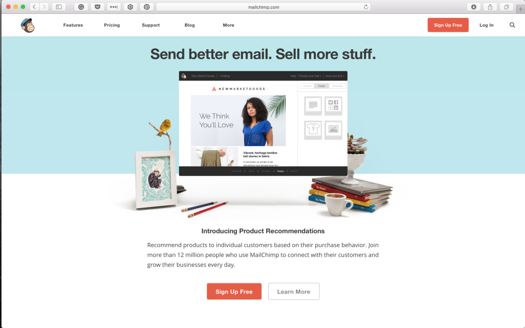
Mailchimp also has a short homepage. Though they offer detail on many of their other pages the homepage drives users to sign up or learn more.
Slack
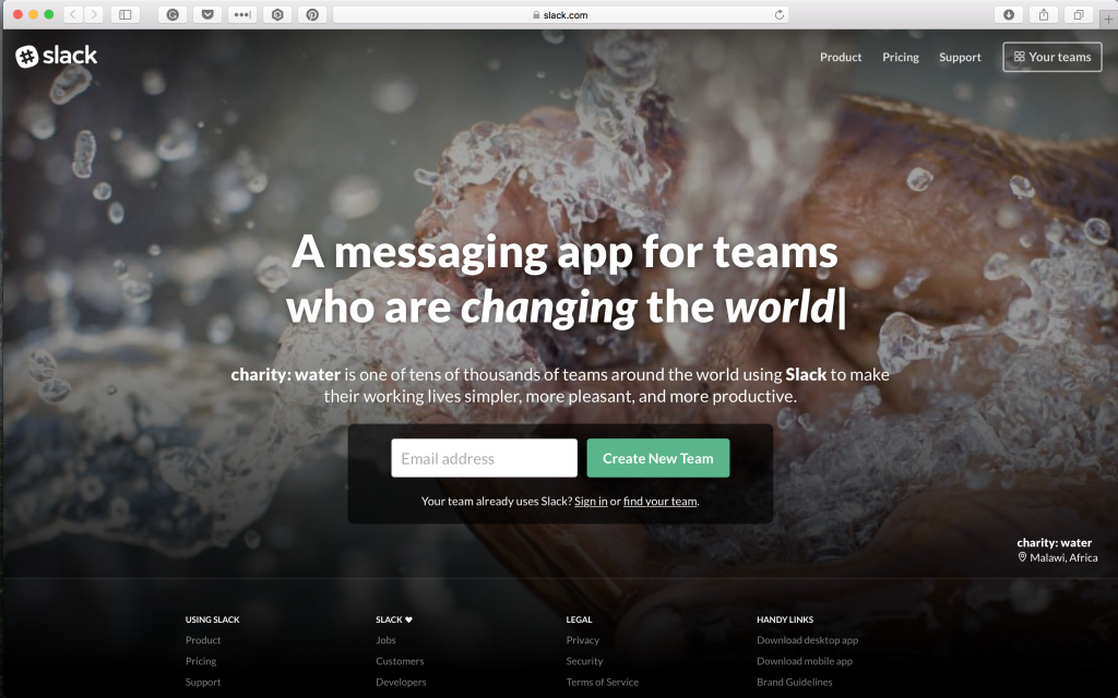
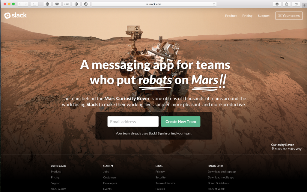
Slack is the every popular messaging application. They have three versions of their homepage right now. Each one focuses on a different case study. We have included all three designs below.
Berkshire Hathaway
Maybe the original short homepage design? There is a great discussion why they have not invested in a new website on quora.




Loading…