
This Photoshop tutorial will explain how to make a web 2.0 glossy logo or icon if you like. I tried to keep it as simple as possible. If you have any questions post them in the comments below.
I am starting with a 400×300 px white canvas. Draw your basic shape. I have started with a custom shape from Photoshop‘s presets.
Step 1
Fill the shape with a nice orange color (I am using #ff6600)

Step 2
Apply Bevel and Emboss to the layer using the following values :
Structure
- Style : Inner Bevel
- Technique : Smooth
- Depth : 100%
- Direction : Up
- Size : 200px
- Soften : 0px
Shading
- Angle : 120 (use global light checked)
- Altitude : 30
- Highlight mode : Screen, Opacity : 75%
- Shadow mode : Multiply (color : #ff0000), opacity 75%.

Step 3
Stoke the layer with an orange color 3 pixels in size (I am using the same orange as the fill : #ff6600)

Step 4
Apply an inner glow, size 40px.

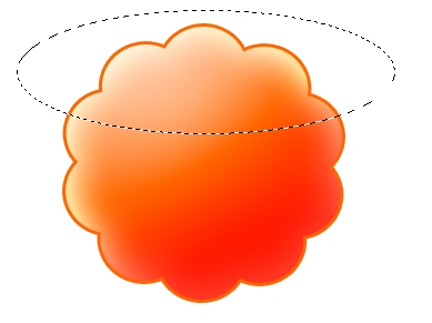
Step 5
Create a new top layer and using the Elliptical Marquee Tool create an oval over the top of the original shape layer. Fill this layer with gradient from white to transparent (white at the bottom, transparent at the top). Give this layer a 50% opacity. You may rotate this layer so it will look cooler.

Step 6
Make another top layer and using the Elliptical Marquee Tool create an oval over the bottom of the original shape layer. Fill this layer with gradient from black to transparent (black at the top, transparent at the bottom). Give this layer a 80% opacity and a soft light or a hard mix blend.

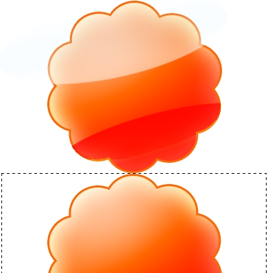
Step 7
Now to create a nice mirror effect we’ll move all the layers to the top of the canvas and duplicate the original shape layer. Flip Vertical the clone of the shape layer and align it so it touches the bottom of the original shape layer.

Step 8
Add a new layer and using the Rectangular marquee tool make a selection starting at the bottom of the original shape layer like in the image below. Apply to this layer a gradient from white at the bottom to transparent at the top.

Step 9
Add some nice text using a good typeface and you’re set.

Loading…