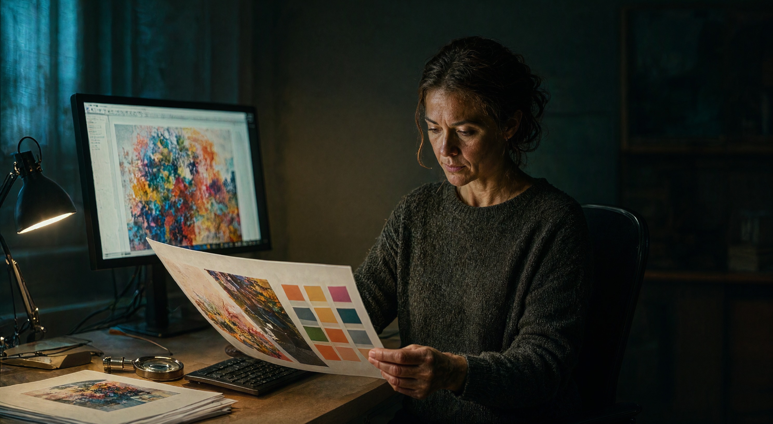
Even Pantone joined in. The color authority launched a palette generator on Azure OpenAI, sitting next to Huemint, Coolors, and a shelf of tools that produce usable color schemes in seconds. Generators optimize for harmony, trend fit, and brand feel, and they have gotten good at it. What none of them guarantees is the property that decides whether a palette works in the wild: enough contrast between the text and its background for every reader.
The check is arithmetic
WCAG 2.1 sets the thresholds. Body text needs a contrast ratio of 4.5 to 1 against its background. Large text and UI components need 3 to 1. The ratio comes from relative luminance, which you can compute from any hex pair, and the W3C documents the method. Nothing about the calculation involves taste. A generator can produce a gorgeous sage-and-terracotta scheme whose body text on the sage background fails at 2.8 to 1, and no amount of harmony rescues it.
The tools know this. Huemint exposes a contrast matrix so you can steer its machine-learning output toward accessible pairs, and guides for AI palettes now walk through the WCAG pass as a separate step. The workflow is short: generate the scheme, test every text-on-background pair, and when a pair fails, adjust lightness rather than hue. Lightness moves the ratio. Hue moves the vibe.
Why our pipeline cares
We name a palette in every image prompt we send: teal and amber for one post, terracotta and sage for another, dark backgrounds for most. The reason is partly contrast, and it lives in the card layout rather than the image. Our blog renders the post title as light text over the thumbnail. Images with dark, moody areas behind the title pass the contrast check by construction. Images with busy bright middles fight the overlay, and the card becomes hard to read before anyone opens the post.
That is why the "generous dark breathing room" instruction shows up in every pin prompt we run. The dark space is a contrast reservation for text the image itself will never contain.
Where generators earn their keep
Use the generator for exploration. It proposes combinations a tired brain at 11 p.m. would never reach, and it does it before the project has a direction. Then run the pairs through a contrast check before anything ships, and let the numbers pick which exploration survives. Speed generates the options. The ratio decides the shortlist.
Brand palettes deserve the same pass. Designers approved most style guides on screens, in daylight, at full brightness, with good vision. Readers arrive tired, on phones at low brightness, with older eyes. The palette that passed the conference room fails the bus stop, and the fix costs one lightness adjustment made two years earlier.
Fast palettes are a gift. Run the arithmetic anyway, because the reader's eye does not care how the colors were chosen. It cares whether the words survived them.
Sources
The reported facts in this post come from these sources:
- W3C documents the WCAG 2.1 contrast minimum: 4.5 to 1 for body text, 3 to 1 for large text and UI, with the luminance method.
- Microsoft announced the Pantone Palette Generator, built on Azure OpenAI inside Pantone Connect.
- Huemint generates palette schemes by machine learning and exposes a contrast matrix for steering output toward accessible pairs.
- AI Colors published a practical guide to running the WCAG contrast pass on AI-generated palettes.