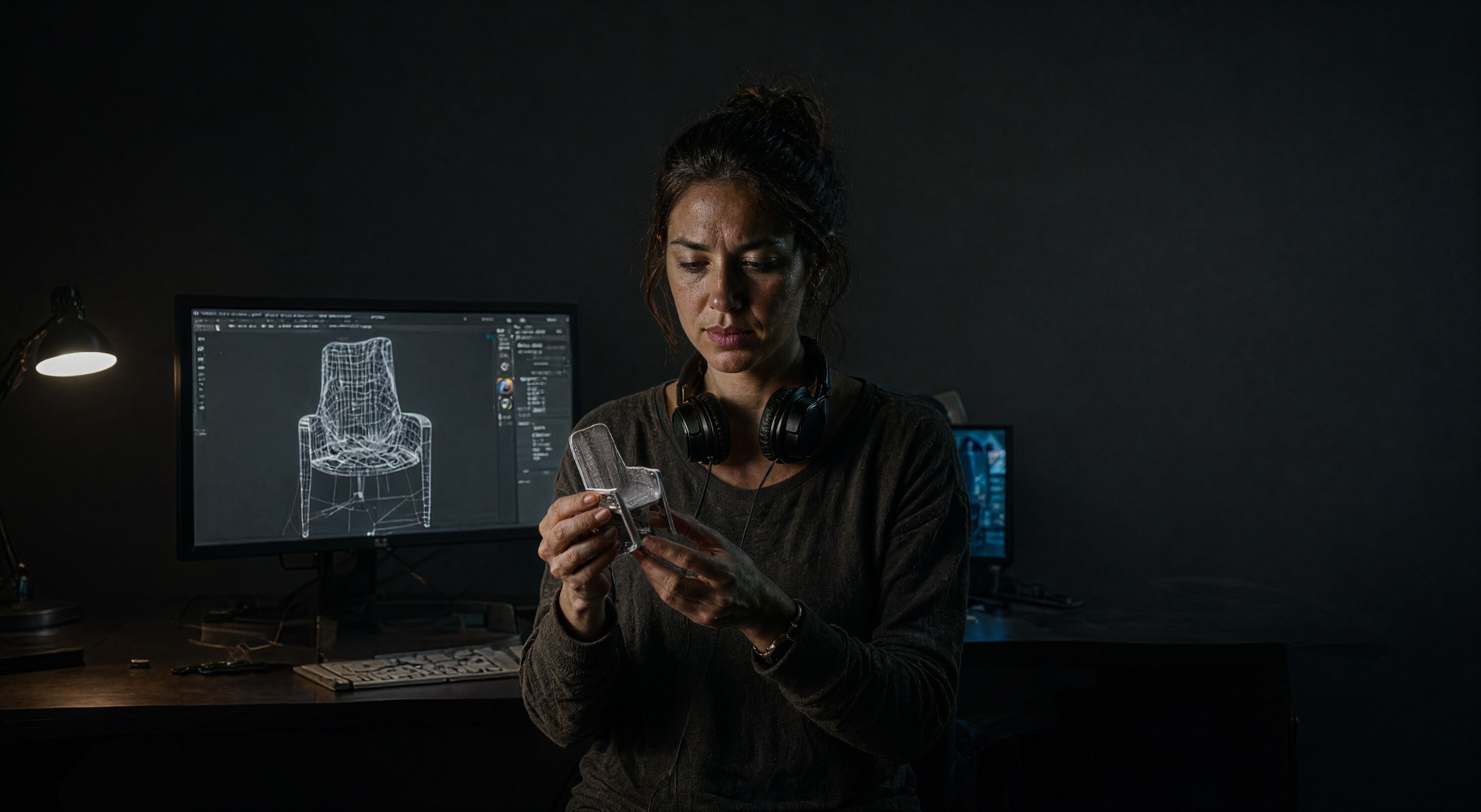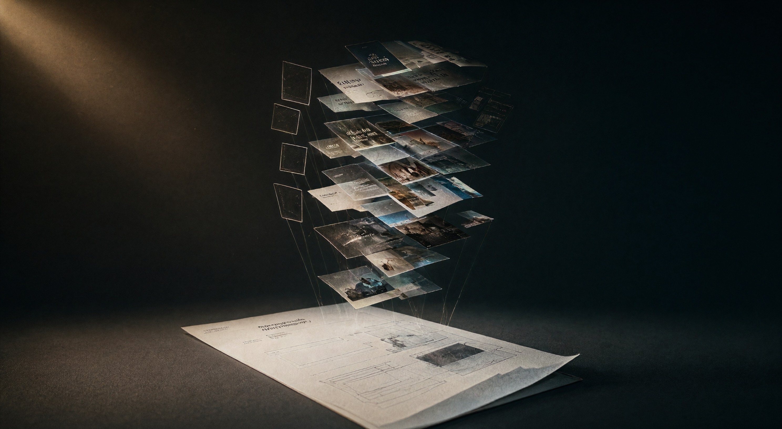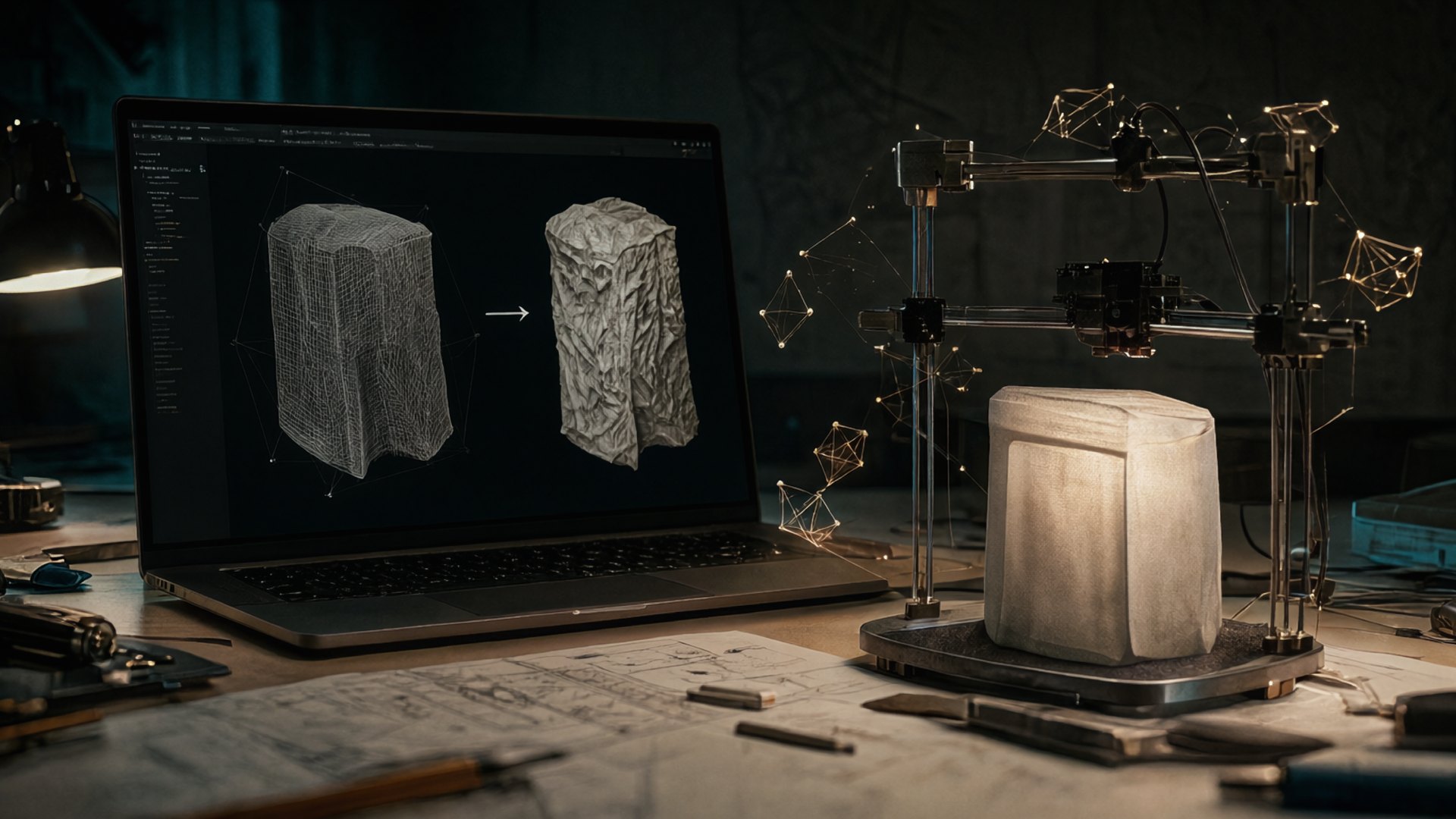
FESPA published a piece on AI in color management this month. Print shops that put it to work report less wasted ink, shorter setup times, and tighter color on digital presses. Meanwhile the same shops receive artwork from designers who generated their images in AI tools and skipped print prep entirely. Esko's blog named the gap in March: AI design tools mean many designers no longer carry deep printing knowledge. The image still ends up on paper. Three checks keep it printable, and all three live between the generator and the press.
The gamut collapses in the loud colors
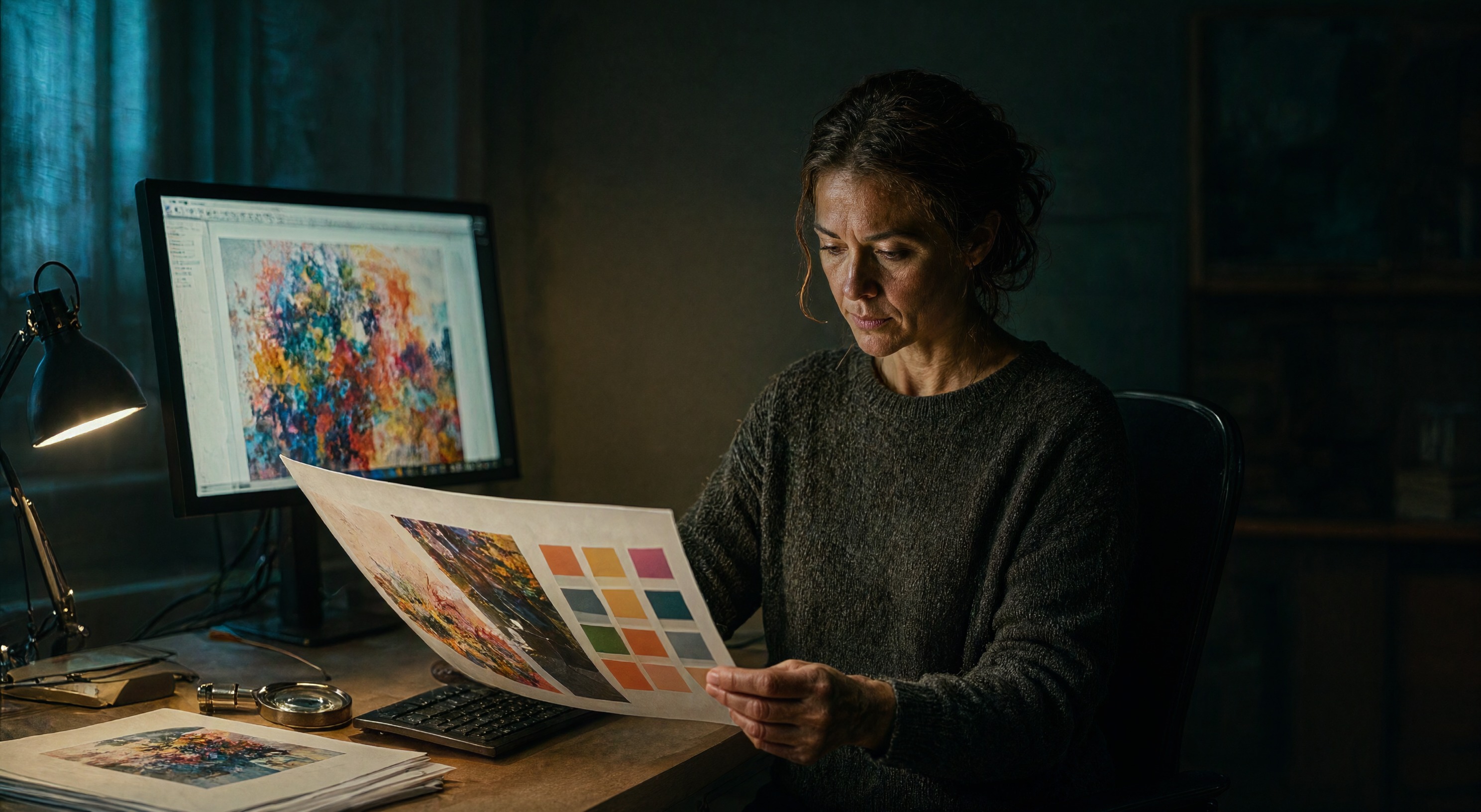
Generators render in RGB. Our own pipeline outputs 16-bit PNGs in sRGB. A press lays down CMYK ink, and the CMYK gamut is smaller. The colors that fall out first are saturated cyans, electric blues, neon greens, and hot oranges, which happen to be the shades AI images reach for. Smartpress, a working printer, keeps human judgment central in production for this class of decision. Soft-proof the CMYK conversion before you approve an image for print. Expect the shift in the loud range, and when the job needs accuracy more than punch, pick a palette that survives conversion.
Do the resolution math at 300 DPI
Screens forgive. Paper counts pixels. Print quality lives at 300 dots per inch at final placed size. Our Qwen Image 2.1 render lands at 2976×1632 pixels, which covers 9.9 by 5.4 inches at 300 DPI. An A4 page needs 2480×3508 pixels portrait, so the render gives enough width and less than half the height. The upscale pass in our workflow adds pixels through a second render and an enhancement model, and interpolated pixels pad the file without inventing detail the model never drew. Place the image smaller, crop tighter, or upscale on purpose and inspect the soft edges. Full-bleed layouts eat another 3 to 5 millimeters on every edge for bleed, which shrinks the safe area again.
The text rule doubles in print
Garbled type on a blog thumbnail reads as a bug, and the reader scrolls past. The same garble on a shipped brochure sits in someone's hand and reads as a defect. We end every image prompt with a no-text instruction, and for print the rule hardens: keep all words as live vector type in the layout app and let the model draw scenes only. The same goes for logo marks. Vectorize them before press, because a raster logo that looks fine on screen breaks up at press resolution.
The QC pass that transfers
Most of the checks from our nightly image pipeline survive the jump to paper: faces at medium distance, hands holding a real object, one action per figure. The current model generation renders those scenes clean, and print adds three more checks: soft-proof the CMYK conversion, confirm 300 DPI at final placed size, keep text out of the raster entirely. Esko's argument was that AI removes the repetitive prepress work and leaves operators the judgment calls. The three checks above are those judgment calls, moved upstream to the designer's desk.
The generators got good enough that the hard part moved downstream. FESPA's color-management story shows the print side automating its checks. The design side owes the press the same discipline. Run the three checks before you send the file, and the image survives the trip from screen to paper.
Sources
The reported facts in this post come from these outlets:
- FESPA reported this month on AI color management in digital printing: less waste, shorter setup times, tighter color.
- Esko argued in March 2026 that AI design tools let prepress operators focus on judgment work instead of repetitive tasks.
- Smartpress described in October 2026 how a working print shop uses AI for idea generation while keeping human expertise central in production.