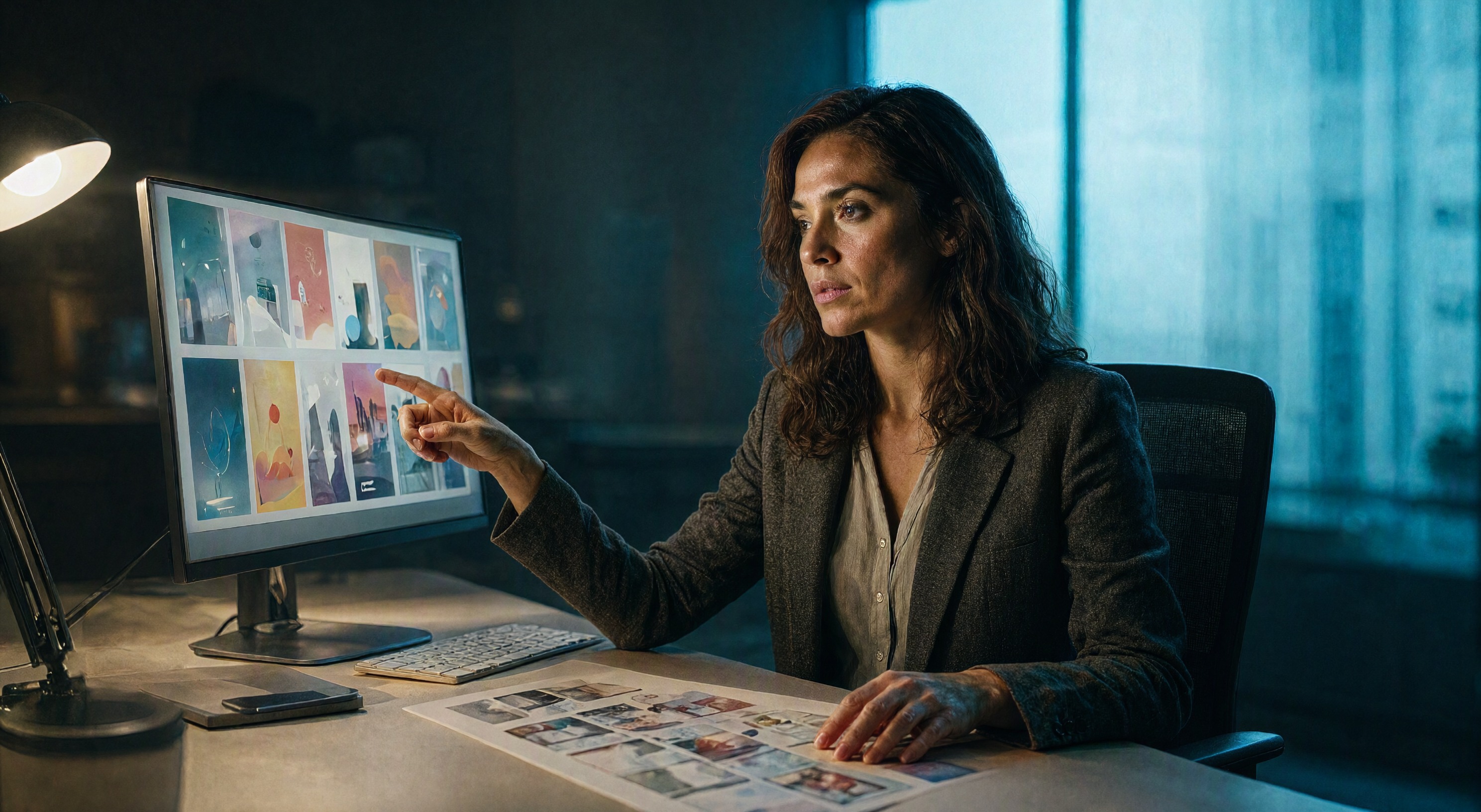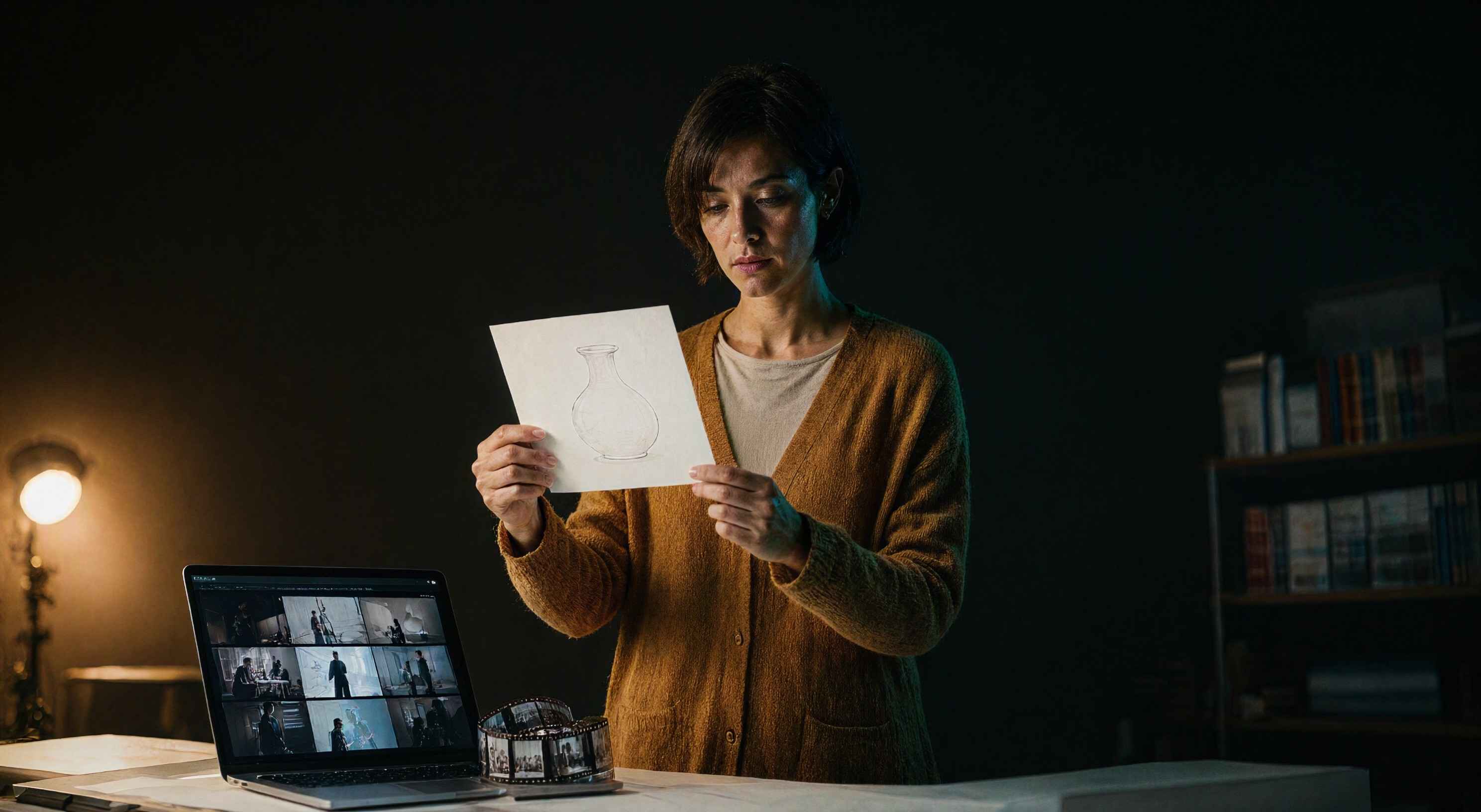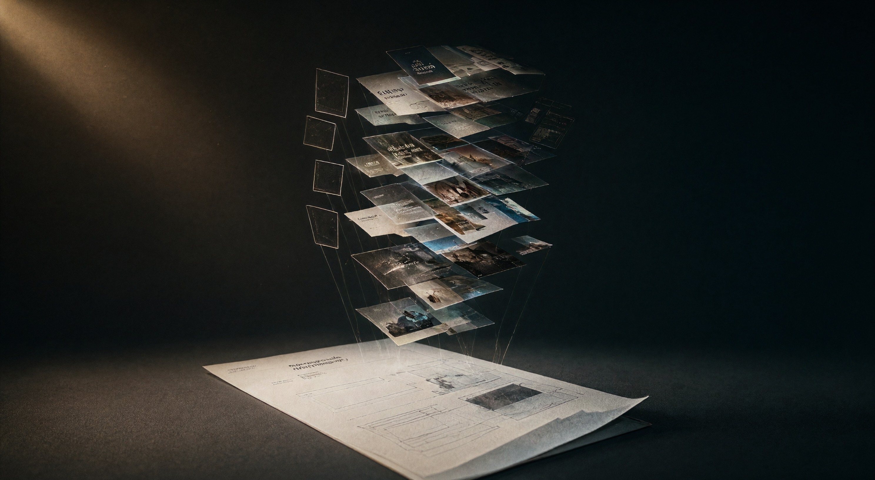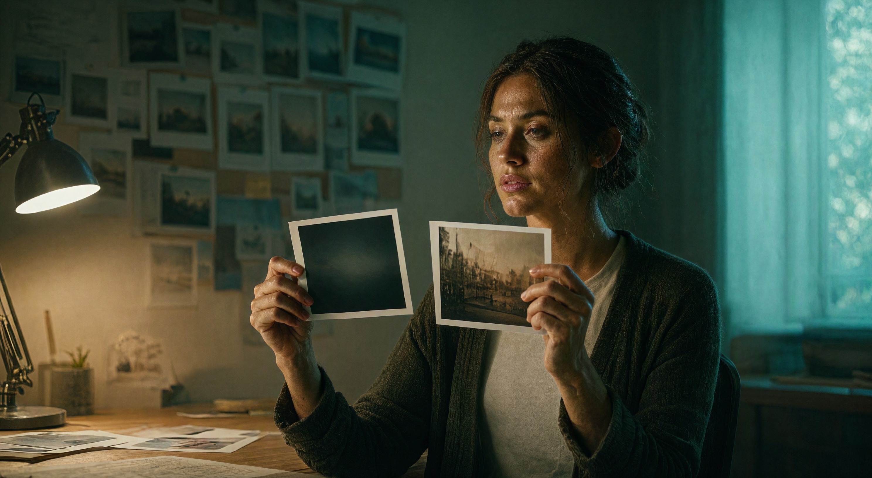
We generated twenty-two blog hero images this fall and every one came out abstract: isometric desks, glowing spheres, threads of light, workspaces with nobody in them. The style looked clean in isolation. Lined up on a blog index it read as stock filler, and stock filler is what readers scroll past. On 5 November we killed the style on both of our blogs. Every hero image now carries one person doing one thing. Here is what the change taught us about prompting image models for content work.
What the abstract look hid
An abstract render answers the question "what is this article about" with a mood. A person at work answers it with a sentence. You read the scene the way you read a photo caption: someone reviews ad layouts, someone traces a logo on a tablet, someone checks a color proof under a lamp. The card stops competing with every other gradient rectangle in the feed.
The abstract style also hid a modeling convenience. Objects and light hides artifacts. Faces expose them. We had been avoiding the hard part of image generation because the easy part looked professional.
The prompt anatomy that works
We run Qwen Image 2.1 Turbo through ComfyUI for every hero and every Pinterest pin. Turbo mode takes 8 steps at CFG 1 with no negative prompt, so the prompt carries everything. The frames that survive review share an anatomy:
- One named person. Age range, wardrobe, styling. "A young woman designer in a smart blazer" renders clean. "A creative professional" renders as mush.
- One action. Pointing at a monitor, holding a proof sheet, tracing a sketch. Hands mid-action beat posed hands.
- Hands on an object. A phone, a stylus, a printed sheet. The model draws hands better when the hand holds something specific.
- Medium distance. Waist-up or over-the-shoulder framing keeps faces clean. Tight face close-ups are where the artifacts live, and complex finger poses are where the second artifact lives.
- Light direction and palette. "Warm desk lamp from the left, cool window light from the right, blue and teal with amber accents" gives the render structure a mood adjective never will.
A full prompt ends the same way every time: "No text or words in the image. Photorealistic rendering, cinematic depth of field, 16:9 widescreen format." The no-text tail matters more than any style phrase. Every model in this generation garbles type, and garbled type on a thumbnail reads as a bug. The October image model updates moved quality forward and none of them solved text.
One scene family, two formats
Each post needs a 16:9 header and a 2:3 Pinterest pin. We generate both from the same scene family: one render at 1980×1080 for the card, a second pass at 800×1200 cropped to 1000×1500 for the pin, the same person in both. The board pin and the blog card now recognize each other, which is the whole point of a thumbnail system.
The correction itself lives in our team brain on Memkist, so the agents that run the nightly pipelines on both blogs pick up the rule before their next generation run. A style decision that lives in one person's head dies with the session. Written down where the agents read, it holds.
What we gave up
Abstract images survived any topic. A person ties the hero to a setting, and a wrong setting misleads: a designer at a desk undersells a piece about 3D mesh generation. The fix costs one extra decision per post, and we make it while choosing the thumbnail crop anyway. We learned more about our own readers from one week of faces and hands than from twenty-two clean, forgettable images. The same QC rule now runs through our ad-creative work: faces at medium distance, hands holding something real, no garbled text anywhere near the click.
Sources
Our own pipeline produced the before and after in this post. The tool roundups we read while framing it, and whose abstract-friendly defaults this piece pushes against:
- AI Tools for Graphic Design: The 10 Best Platforms in 2026 (Toools Design)
- Best AI Graphic Design Tools for Creatives (2026) (Format Magazine)