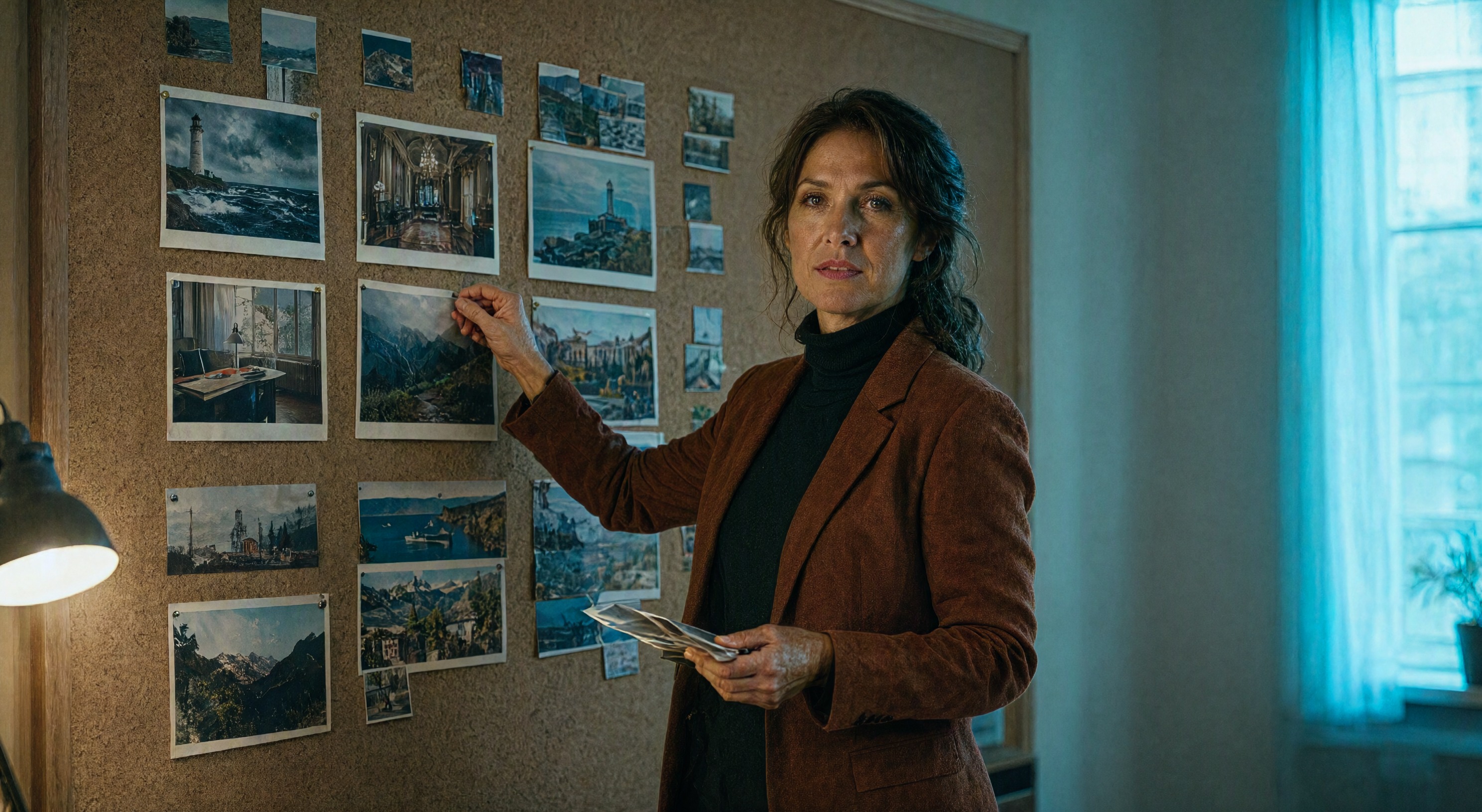
Researchers ran image generators in autonomous loops: one model prompts, another judges, the first revises, round after round, with no human in the room. The outputs clustered into twelve photographic templates. Stormy lighthouses. Palatial interiors. Over-the-shoulder laptop shots in teal-lit rooms. The authors of the study, published in the journal Patterns, named the look "visual elevator music." News coverage reduced it to a shareable line: generators default to the same twelve photo styles.
We run two blogs whose images come out of a generator nightly, and the study describes our weekdays. Left alone, every render drifts toward the same commercially safe mean: the same desk, the same lamp glow, the same three-quarter gaze. The pattern is measurable, and the escape is editorial. What follows is how we break it in practice.
The gravity comes from two directions
The first pull is the training mean. A generator asked for "a beautiful photo" lands on the statistical center of its training set, and the center of stock photography is a safe, symmetrical, softly lit nothing. The second pull is the loop. A study on algorithmic visibility traced the cycle: designers publish AI images that look right, those images re-enter the web as training data, and the model's center of gravity tightens. The feed rewards the familiar, the familiar trains the model, and the model feeds the feed.
The Patterns study added the detail that matters for working designers: the clustering happened fastest in the loop condition. A generator judging its own outputs converged quicker than one left alone. Chasing your own taste with your own tool makes the elevator music louder.
The prompt slots that break the pattern
Our nightly pipeline renders heroes and Pinterest pins through Qwen Image 2.1, and the anti-convergence work lives in five slots we fill before any style words:
- A named person. Age range, wardrobe, one detail of styling. "A woman in her late twenties with a dark green cardigan" resists the mean. "A creative professional" surrenders to it.
- One action with an object. Holding a printed proof, pointing at a monitor, tracing a sketch. Objects anchor the scene in a place and a trade.
- Light with a direction. "Warm desk lamp from the left, cool window from the right" beats "moody lighting" because it forces a decision the template cannot fill in.
- A palette by name. Teal and amber, charcoal and cream. Named palettes shove the render off the default grading.
- One slot varied at a time. Fixed seed, change the wardrobe, regenerate. The variation stays legible and the family stays recognizable.
The abstract-image era we retired last week made the convergence worse, because abstract renders collapse into the same spheres and light threads as everybody else's. Putting a person in the frame was our first break from the mean, and the five slots above keep us out of it.
What stays hard
Escaping the templates costs effort because the templates are what the model is best at. A cognitive-science review found human raters still score human-made art higher on liking, beauty, and novelty, even when they cannot explain why. The generator's center is smooth and competent, and everything off-center needs a designer's hand to reach. That is the trade: the mean is free, and the mean is elevator music.
Brief your subject like a casting director, not a mood board. Name who walks in, what they hold, where the light comes from, and which colors own the frame. The twelve templates fill every slot you leave empty.
Sources
The reported facts in this post come from these studies and coverage:
- Patterns (Hintze, 2026) published the autonomous generation-loop study: outputs clustered into twelve photographic templates, described as "visual elevator music."
- ACM (2026) examined algorithmic visibility and the human-algorithm feedback cycle behind converging design aesthetics.
- PMC (Bara et al.) reviewed the cognitive science of AI-generated visual art: human raters score human-made work higher on liking, beauty, and novelty.